Hello there! Time is crazy and I haven’t been updating the blog as much as I’d like to. But here I am and I hope you enjoy it.
This 2024 I took the decision to step up my involvement at Power BI User Group Barcelona and started organizing online events from international speakers. For those that present in English I even do some live interpretation that is recorded and remastered with the video stream so that we get the renowned presenters in both English and in a not-perfect Spanish translation (check out the events here and the recordings here). But why am I speaking about that? Well, first of all to brag about it because these sessions have been awesome, but also because the most recent one is the starting point for this blog post.
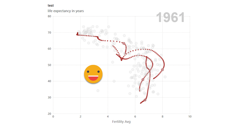
On April 26, 2024, Carlos Barboza raged through 20 charts (yes, twenty) in what was supposed to be a 60 minute session. Well, it turned out to be more like a 90 min session, but it was well worth it. One of the charts was a scatter chart showing the fertility rate and life expectancy in different countries, being able to move the year and seeing how all the dots moved around. He took an article from Robert Mundigl and worked to recreate the interactions achieved in excel. He presented a way of letting the user customize the tooltip, but mentioned that it was not possible to show the path of a single country in Power BI just yet. And this got me thinking.
I haven’t worked much with scatter charts to it took me a while to get the grasp of it. In general we expect to use fields on the axis and measures on the chart area, but with scatter charts is the other way around. The number of data points is the number of different values you have on the field that you use in the «values» well of the visual object, while the position of these data points are indeed the values of two measures, one for the x-axis and one for the y-axis. Of course if one or both measures are blank, the data point will not be shown. All this is very important. To understand where this is going, let me show you the final result, which could be further polished but is enough to make me happy:
As you can see the final result is quite cool, so how did I do it?
The easy bit
The data model is quite simple. We have a fact table «data» with:
- Year
- Country
- Fertility
- Life Expectancy
And two measures:
-
Fertility Avg = AVERAGE('data'[Fertility]) -
Life Expectancy Avg = AVERAGE('data'[Life Expectancy])
So far so good.
A number parameter is used to be able to scroll through the years 1950 to 2013. And a relationship is built to filter the fact table.
Also, because we don’t want to use columns from the fact table directly (just in case) we create a dimension for the Country
Countries = all ( data[country] , data[continent] , data[region] )
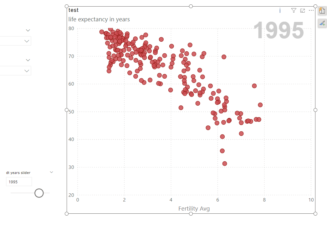
With this we can create already the standard chart. A data point for each country, and they al move when we slide the year up and down.
The tricky bit
Here the first hack. To highlight the country in a different color and show it’s path, we’ll use a different scatter chart object, placed exactly behind the one just described. Why a different scatter chart? Because we need to show a different granularity of objects, but also (and most importantly) we want to change what is shown based on the data point selected from the first chart. And why behind? Well, otherwise we cannot interact with the data points. With this out of the way, let’s get on into the details.
Our goal is to be able to show for any single country all the values from each different year, highlighting of course the current year. The first important bit here is the granularity of our chart, we don’t want to show just countries, we want to show country-years. At this point is important to note that I’m not claiming that this is the best DAX implementation, it’s just a DAX implementation that works to proof that this kind of chart can be built in Power BI, that’s all. Some of the steps might raise a few eye-brows from a modeling point of view. Bear with me and if you manage to find a better implementation, please let me know. Coming back to the story, we need to chart country-years, so we will need a field that has a different value for each country year to put into the «values» well of the visual object. Well, we don’t have that (yet) so we’ll just go ahead and create a calculated column in the fact table, just because I don’t really have the source data ready and I’m playing around with the file from Carlos. And maybe (maybe) to piss off Chris Wagner a little tiny bit.
CountryYear = data[country] & data[year]
Not just happy with a calculated column, I’ll go ahead and create a calculated table as well with all the country-year combinations as well.
CountryYear =
    ADDCOLUMNS(
        CROSSJOIN(
            ALLNOBLANKROW(  data[country] , data[continent] , data[region] ),
            ALLNOBLANKROW(data[year])
        ),
        "CountryYear",data[country] & data[year]
    )
In this particular case we create a table as large as the fact table, but here the idea is that this table should have the granularity you want for your chart. Inside my head I do think that the chart should be possible without this table, but I haven’t managed to make it work, so we’ll stay the course and show you how I built it. We will now create a relationship between the two CountryYear columns, making sure that the CountryYear table filters the «data» fact table. We are doing crazy things, but not *that* crazy.
So we copy our chart, and replace the Country field by the CountryYear of our new calculated table. We can go ahead and change the color of the markers to a nice reddish color. However, we will not see much difference from our original chart.
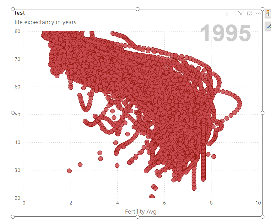
What is going on? Well, for starters, we still have the year filtering our data. So even if we have CountryYear as values field, only the selected year is visible. Everything we will do now can be done with just measures, but I like to have simple measures doing the basic calculation, and then solve other stuff (like a filter that should not be there) with calculation groups. This one is quite easy. We want to get rid of the filter from the year slider.
-----------------------------------
-- Calculation Group: 'Remove Year'
-----------------------------------
CALCULATIONGROUP 'Remove Year'[Remove year]

    CALCULATIONITEM "Remove DT years v1" =
        CALCULATE (
            SELECTEDMEASURE (),
            REMOVEFILTERS ( 'Year' )
        )
If we apply this calculation item as an object level filter, we get something weird but somewhat closer to what we want. We finally have Country-Years:
Now it’s time to only show whatever is being selected in the front chart. How are we going to do this? Yep, another calc group. This one is a bit sneakier
------------------------------------------------
-- Calculation Group: 'Show Only Cross Selected'
------------------------------------------------
CALCULATIONGROUP 'Show Only Cross Selected'[Show Only Cross Selected]
    Precedence = 1

    CALCULATIONITEM "Show Only Cross Selected" =
        IF (
            ISCROSSFILTERED ( 'Countries'[country] ),
            VAR _selectedCountries =
                VALUES ( 'Countries'[country] )
            VAR _currentCountry =
                SELECTEDVALUE ( 'CountryYear'[country] )
            RETURN
                IF (
                    _currentCountry IN _selectedCountries,
                    SELECTEDMEASURE ()
                )
        )
First it took me a few trial and errors to find the right function to determine if there was any country selected on the top chart. ISCROSSFILTERED is your friend: returns true if one or more data points are being selected. To be honest when I started writing, the dax only considered a single selection, but looking now at the code I realized that it can be made with more than one data point, which is cool. To figure out the DAX we need to get tiny and stay inside a single data point. For that data point, country will only have a value, and it will be the same for all the years of the same country.
Let’s see if it works:
Awesome! But we definitely need to make markers from other years waaaay smaller than the selected year, or the chart is messy and hard to understand. There’s a gotcha here too, so let’s see. My naive daxer just defined a measure to define the size, based on the measure that is used for the front chart. However, that would not work…
MEASURE 'data'[Marker Size Front] = 1

MEASURE 'data'[Marker Size Back] =
    VAR _selectedYear =
        SELECTEDVALUE ( 'Year'[dt years slider] )
    VAR _currentYear =
        SELECTEDVALUE ( 'CountryYear'[year] )
    RETURN
        IF (
            _selectedYear = _currentYear,
            [Marker Size Front],
            [Marker Size Front] / 10
        )
There should be all but one markers with a smaller size, but it just does not work. The problem? THE FILTER CONTEXT!! (what else?) If you rewind a few steps you’ll see we set up a calc group that did what?? Get rid of the filter on year! Ouch. Therefore the «_currentYear» variable is always blank as it sees all the years of the table. So what do we do?? For some stuff we want to get rid of it, for others we don’t. Well, Calc Groups have options to define this sort of things. For this case I went for something quick and dirty like this:
CALCULATIONGROUP 'Remove Year'[Remove year]

    CALCULATIONITEM "Remove DT years v2" =
        IF (
            NOT ISSELECTEDMEASURE ( [Marker Size Back] ),
            CALCULATE (
                SELECTEDMEASURE (),
                REMOVEFILTERS ( 'Year' )
            ),
            SELECTEDMEASURE ()
        )
So the Marker Size Back measure is the only one that can see the year that has been selected. In general I rather define the scope of the calc group rather the «not scope» of it, but in this case I made an exception. Let’s swap the calc item and see the result!
That’s pretty cool I would say!
A reporting Pro like Carlos Barboza or Claudio Trombini would countinue to refine the chart, but I think that for this post this is enough
It’s now your turn to bring it to new heights!
Follow the conversation on Twitter and LinkedIn