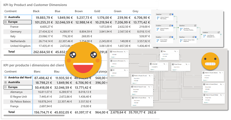
Hello again!
Before life gets in the way, let’s try to wrap this up. If you have not red the first part, please do so before reading this one as some of the outputs of that part are necessary for the process we’ll see here. In this post I want to tackle the actual report. Since it’s not really data what we’ll translate I’ll call it metadata, but it’s not metadata either. We’ll extract all the titles, subtitles, text boxes, as well as which fields are used where, and crucially what’s the display name that is being used for a particular visual. Of course we may find a field for which no specific display name has been set, but we’ll use the original field name as display name and we’ll take it from there. But enough of all this talking, let’s get to it!
Step 1: Preparing the report
This is the area where I failed learned the most. PBIR just landed and I was supper excited because this opened the possibility of extracting everything I needed to know about the visuals. Each visual has a visual.json file and *everything* is there if you have enough will and patience.
When I started I got so much carried away when I managed to extract the titles and translate them that once I got the table with both languages I created the measure to switch between the two and I would remove the hand-written title by the measure.
It does not sound as such a bad idea, right? Well, turns out it is! Let’s imagine you replaced the manual title by the measure. Now imagine you realized you made a small typo in the title. How are you supposed to fix it?? Well, you need to switch back to manual title, write it again, etc etc. And it gets worse. With the fields used in a visual, we could replace them by field parameters that use the fields of the appropriate langue, but what if you need to change them? it’s even trickier to go back to fix it.

An there’s more. When you use field parameters in visuals, if you check the visual.json, you see both: the fields (columns and measures) along with the fact that there’s a field parameter. When I started swapping actual columns and measures by field parameters, I thought I would be fine as long as I was careful enough to set the report in the base language. However, I discovered that this sync is not fool proof and I ended up having a mixture of translated fields and original fields. You don’t want that.

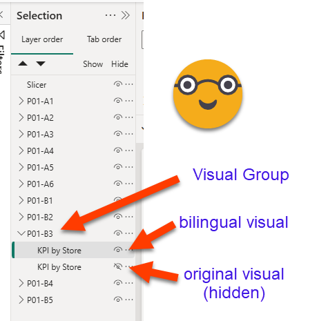
All this to say that you need to keep your original visuals (hidden). Of course you will need new visuals that use the measure for title and field parameters in the field sections and so on. And well, we will need some way to connect the two. The best way to do that is –you guessed it– to group them! (duh!). (That was not my first attempt, but I’ll save you that — I’ll just say it included an external file and manual mapping of GUIDs to more manageable ids. )
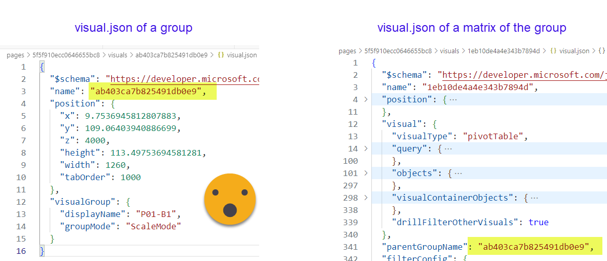
To my surprise, groups have their own visual.json file and have a name, displayname and almost no properties. It’s rather on the different visuals that when you check their visual.json file that you will find a parentGroupName property.
To be honest, it’s not a technical requirement that you group both visuals, but it just makes your life much much easier, and it let’s you define your own id that does not change if at some point you need swap the original chart by something else. Also the default ids are just terrible GUIDs.
So now we have for each visual, actually a group of two visuals. One is hidden, with the original fields and titles, the other that will use field parameters and measures instead. As a consequence however, we need to tell apart both visuals with power query because we only need to extract metadata data from the original ones. At first I thought it would not be so tough, after all the hidden flag is pretty high on the json. Extract definition only from hidden visuals. But no. This is not a good idea because sometimes people like to swap visuals with bookmarks!

If this was the data model and not the report, I would go with extended properties to tag things, but AFAIK there’s no such thing yet for the report layer. So what I did is go with a couple of characters in the beginning of the Alt Text property. Before you dash me for using this field for something that is not meant for, remember we are in a hidden visual. If you are using this field (which I think it’s great btw), you can still do and continue adding any text you think will enhance the accessibility of your report. Actually you can probably extend the approach shown here to also translate the Alt Text and create a measure that will serve it in the chosen language. During the extraction process it will become trivial to get rid of those two characters as if they had never been there.

I did not have this problem, but of course you might find yourself with a report that already groups objects in several layers. I haven’t tested, but if you group directly each visual (i.e. no groups inside the new groups created for the translation) you should be fine. We’ll group visuals with the immediately parent groups. All groups you create should follow a coherent naming convention that will allow us to filter our relevant groups. And that’s it.
It’s time consuming but I haven’t found a better way to do it. If I had to translate a zillion reports and PBIR was already in GA, probably I’d try to come up with a script that did this for me. For now though, it’s a manual process — you can listen to music while doing it though as not much mental effort is required for the task.
Step 2: Publish the model in a Fabric workspace
Well, this is not a hard requirement, but we will need to execute a few DAX queries against the model. If the model is in a premium workspace this is quite easy. Remember we are about to do everything with Dataflows Gen 2, so this should not be a problem.
Step 3: «export» as Power BI Project with PBIR enabled and sync to Sharepoint
Once PBIR (well and PBIP) goes GA this step will be unnecessary. As for now what I do is save all changes, and then do a Save As PBIP (with PBIR enabled) in an empty folder in SharePoint synced to my local machine. If I have to do it again after some changes, I will first empty the folder as I’m not sure how it would be handled. Then I wait a couple minutes while all files get synced to SharePoint.

Once PBIR is GA then probably it’s possible to read the files directly from the repo.
Step 4: Extract report metadata
This is by far the trickiest part of this whole series. PBIR json files can be really long, so it’s not always super easy to reach the bits that you want. However this is still way better than the alternative, which would be to write down manually all the titles, subtitles, fields and so on.
Like in the data translation, it might be a bit too much to get in detail about all the powerquery that is used, so we’ll discuss basically what you need to get and in what shape, in order to build our bilingual report.
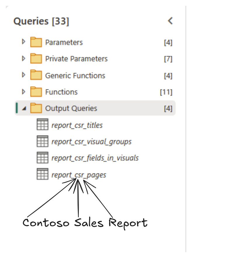
In this step we’ll build 4 different tables from the json files of the PBIR format
General approach
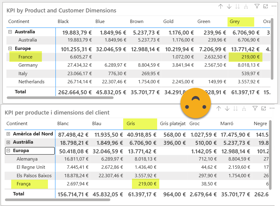
Since we’ll be transforming similar files that are in different folders the easiest way to get to them is through the Sharepoint.Files. We just need to get to the Report.Contents folder. We will only need some info from the pages.json file, each of the page.json files (the name and id only) and then all the visulal.json files. The page list is nice to have mostly to enrich other queries, because unfortunately there’s no way to have dynamic page names in Power BI. I tried with a custom navigation drop down, but in the end we just added both languages inside the tab name. In our local user group we joke that there’s no «owner» in the program group for sheet tabs. After all they are not part of the canvas… so even after that long road map of Miguel Myers we might still have static page names.
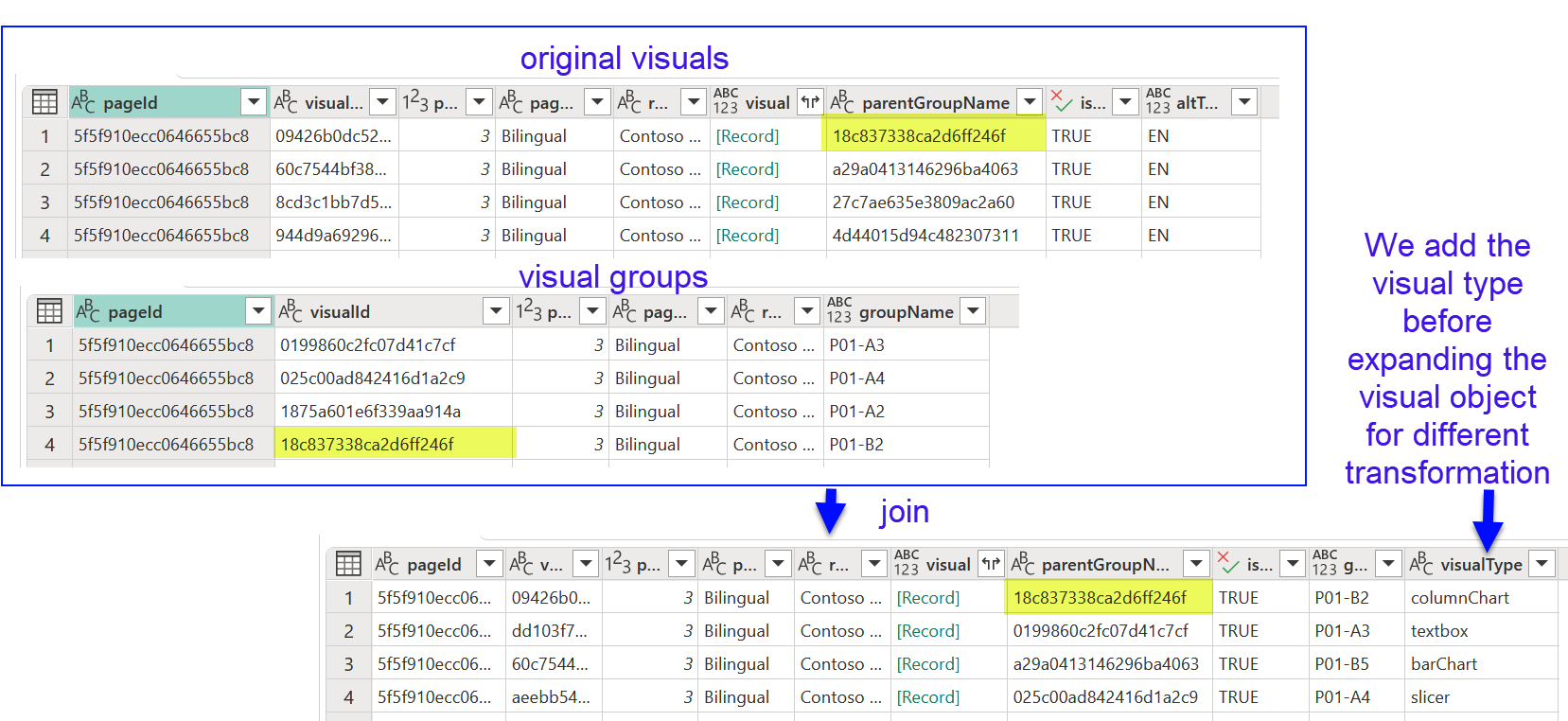
As we mentioned previously, we have our visuals inside groups. And the first unexpected learning of the process is that groups have their own visual.json. So we will basically tell apart the visual groups from the rest of the visual.json files.
The id is actually the name of the folder where they are stored, and getting the «displayName» is straightforward once you know your way with PowerQuery. I just simplified the function from 5 steps to just 3
(VisualGroupJsonFile as binary) =>
let
  Source = VisualGroupJsonFile,
  Custom = Json.Document(Source,65001),
  Navigation = Custom[visualGroup]?[displayName]?
in
  Navigation
Here the key are the question marks. These question marks refer to the field preceding it! If the field is present, return the field, otherwise return null. For these super-nested json records where not all fields are always present this is very convenient. But I just tested it and it works so I guess I’ve just upped my power query rank.

We’ll keep only the groups that we created for translating the report, discarding the rest from our ETL process. We’ll keep that as an intermediate query or function. Joining this list with the page list by id will make our life easier if something is not working properly. (Page name is already present on the previous screenshot)
Next we need to process all non-group visual.json files. As we mentioned we need to keep only those that have the flag in the Alt Text field. This is a bit deep, but we need to get it to avoid making a mess with our process.

As you see we need to expand the record 3 times and being careful that not all fields will be present in each visual.json file. If there’s something if will be a list (don’t ask me why). We’ll expand it and then we need to go 5 level deeper! finally we can clean up a bit for spaces, single quotes and so on to determine if the letters are there or not. BTW why use single quotes inside the double quotes?? why most keywords in lowercase and then suddenly «Literal» and «Value» with uppercase?? so many questions. If you find it hard to stick to a naming convention, don’t be sad. Even Microsoft seems to struggle with that.
Now that we have our original visuals and the translation-based groups, we can join them! Indeed any visual that does not belong in one such groups is of no use, as we’ll have no way to link back to their translations. And before we get dirty with the deeper contents, we can get the visual type by adding a new column and extracting the visualType property. For that we could use the question mark thing we did earlier, or use the Record.FieldOrDefault function, even though this is a property that I would say that’s always there. However, with PBIR and life in general, better safe than sorry.
Table.AddColumn(#"Removed columns 1", "visualType", each Record.FieldOrDefault([visual], "visualType"))
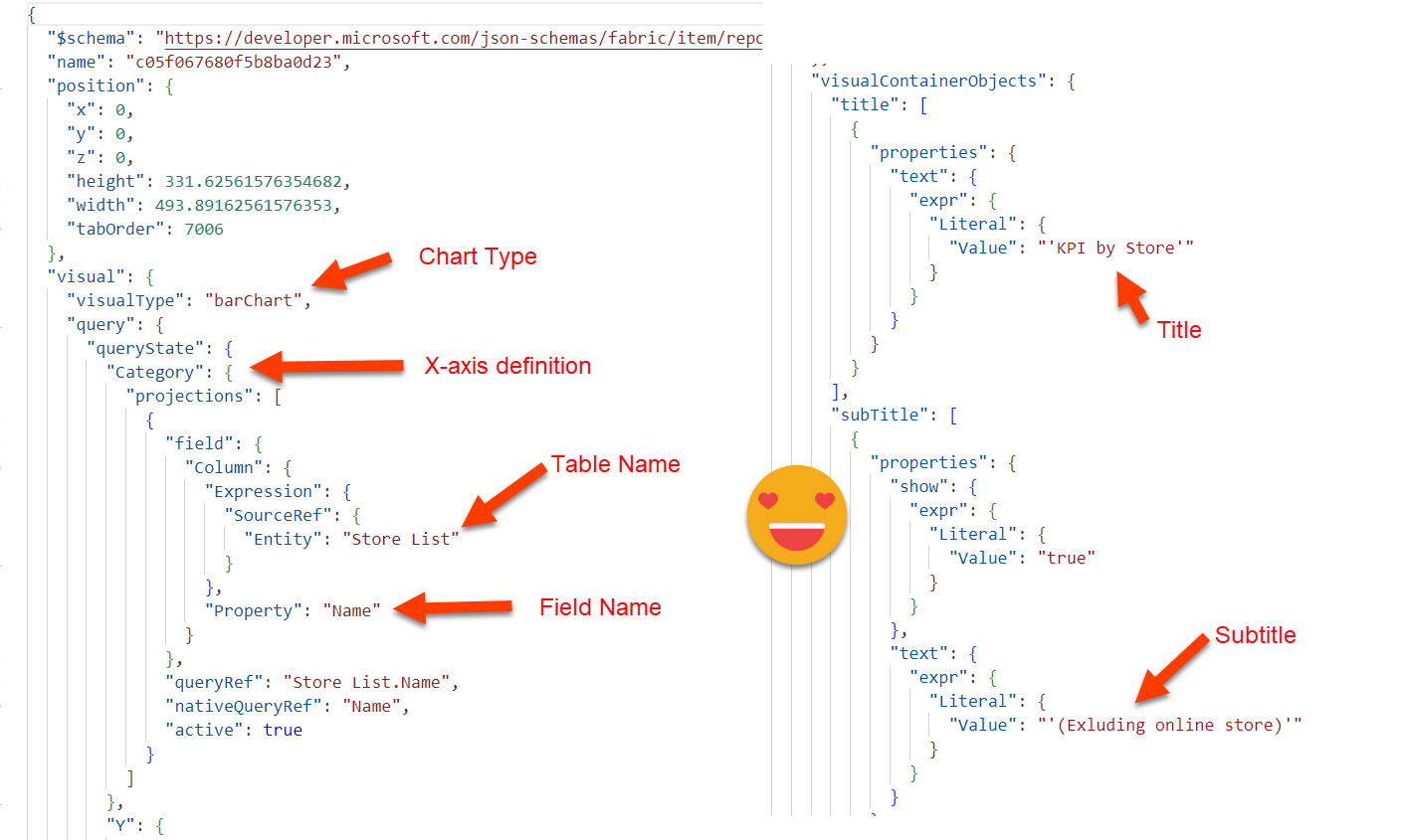
Report Titles
contains titles, subtitles, and text boxes. It could be extended to contain Alt Text and any other arbitrary text at the visual level. Titles and subtitles are pretty close and can come out of the same query. In the JSON though they are different fields of a record, so if you just keep expanding things like crazy you will end up with a mess. Since the internal structure of both objects is very similar, I figured out it’s better to Transpose the record so now we get a column with the name of the field (title, subtitle and others) and another column with the different objects they contain. After writing it a few times I decided to make it yet another function in my power query repository: fxTransposeRecord
As for the rest we need to fight our way through and then append it together. As long as we keep a column indicating what’s the role of each row, we’re fine.
I want to showcase how textboxes can be handled. Since you can define different font sizes on different parts of the text, and probably different alignments depending on the paragraph, the data is stored in a pretty nested structure of a list of lists.
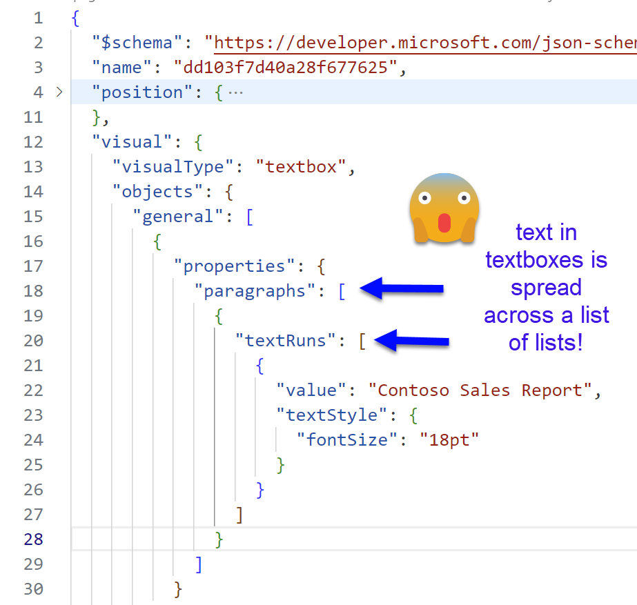
At this point though I thought I was Neo in Matrix and tried my luck with a double nested List.Accumulate. To my surprise it worked!
Table.AddColumn(#"Custom 1", "value", each List.Accumulate(
    [paragraphs],"",(acc, c) =>;
    acc &
    List.Accumulate(
        Record.Field(c,"textRuns"),"",(acc2,c2) =>
        acc2 & Record.Field(c2,"value")
    )
))
As we see we iterate through the different paragraphs starting with an empty string. For each iteration we accumulate the result with the previous iteration and then iterate through all the textRuns of that paragraph, doing the exact same thing. Start with an empty string, concatenate all the text found.
You might notice that even hidden titles are shown. You can probably filter out those rows, but if you leave them is not the end of the world as we will not have that many visuals anyway (100 visuals is already a terrible idea).
visual groups
list of the groups of visuals defined on Step 1. We only want the groups that contain the original visuls and the bilingual visual. Probably a good idea to have all groups with the same prefix or something that let’s you keep them and discard any other groups of the report.

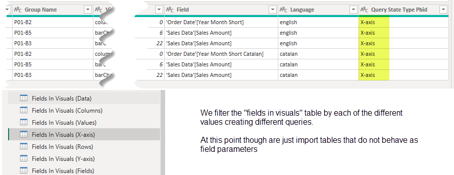
fields in visuals
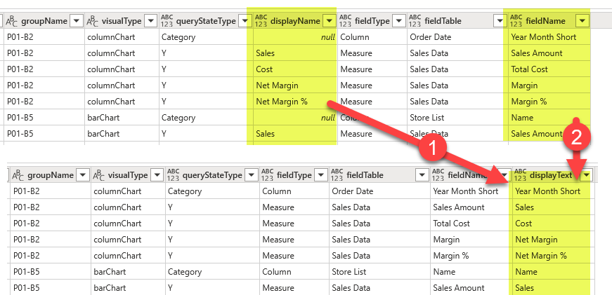
here we’ll keep one row for each field used in each visual. Of course we’ll need to store where in the visual is being used (query state type) and the order in which they appear. We’ll see that not all fields have a «displayName» property defined as maybe not all fields had the name changed for that particular visual. But fear not, as we’ll be using field parameters in which we’ll set the exact name that the field should use, we’ll just consolidate the displayName and the fieldName into a new «displayText» column of the table, why removing the original 2 columns. This is a process I’ve found myself doing often, so I created a nice little function for it.
We’ll complete the query with:
- a field order (just an index column! we just want to keep track in which order we found them in the visual.json file)
- the visual group
- and the page name and order.
Guids are great for machines, terrible for human beings.
pages
This table is mostly a byproduct of the other queries. It’s not that useful because as of today page names are static… Hopefully one day we’ll have dynamic page names, but for now is just a «well I got it because it’s quite easy to get». You can build a page navigator if you want, but the truth is, nobody likes page navigators.

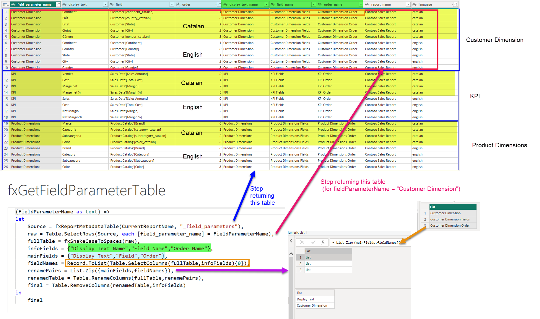
Extract Field Parameters
Field parameters are a beast of its own. The fields of field parameters (display name, field, order) are quite irrelevant in general. It’s rather the contents of the first two columns that we need to pay attention to. This part I covered in one of the first attempts to describe the process.
First thing is to connect to the semantic model through XMLA endpoint and navigate to the semantic model. This will be a step we’ll reuse later a couple times. First time is in the following step, where we’ll execute this query against the model and we’ll get the list of tables that are indeed field parameters (the property that makes something a field parameter is at the column level, but you get what I mean). To use this query the easiest way is to copy it, double the double-quotes and store it into a new non-loading query.
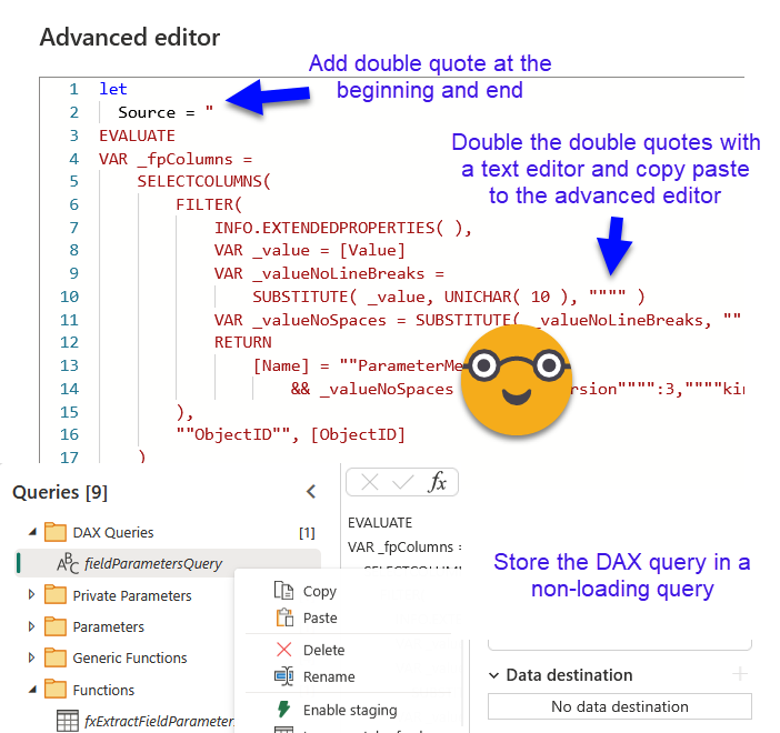
Applying the query with Value.NativeQuery is quite straightforward. In the screen shot we see all the field parameters of the final file, so it does show the original field parameters that we signaled with «(EN)» in the name (that’s the easiest way I figured out we could do that — probably not the most elegant, but it works!)
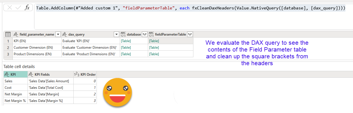
Now we can filter to keep only the original ones (the only ones we have to translate!) and with them it’s easy to create a DAX query to see their contents (EVALUATE ‘Table Name’ ). Then we bring the same step we used in the previous DAX query, but this time as a column of the table (that’s the only way it worked for me). So we can do another Value.Native query and actually see the contents of the field parameter. As usual DAX queries come with all headers in square brackets, so we need to clean that. We can do it with this tiny little function
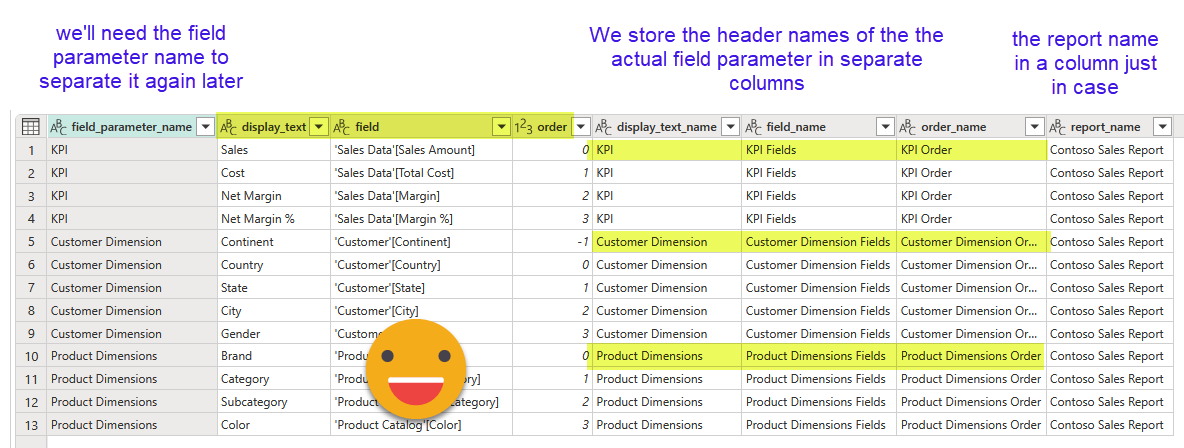
Of course if we expand this new column we’ll make a mess as the table of each row has different headers. We need to think harder than this. This I shared already in my first attempt on this series and looks like this
Table.AddColumn(
      #"Added custom 2",
      "flatFieldParameter",
      each
        let
          fields = Table.ColumnNames([fieldParameterTable]),
          tbl =
            Table.AddColumn(
              Table.FromColumns(
                  Table.ToColumns([fieldParameterTable])
                  ,{"display_text","field","order"}
              ),
              "field_names",
              each
              [display_text_name = fields{0},
              field_name = fields{1},
              order_name = fields{2}]
            )
        in
          tbl
      )
It basically recreates a table by splitting the table into columns and then back into table but this time specifying the field names. Then I add another column that contains a record with the original field names. Since we’ll need to write an actual table in order to translate it and so on, we’ll need to expand this record and clean-up the intermediate tables. The final table looks like this.
Note: I did not have calculation groups in place (I did not do the report after all) so I do not have the process, but it would be somehow similar: identify the tables and expand them all in a single table. We will need to create translation field mapping table with the same naming structure as the ones we created during the data ETL, so that when we «translate» what fields need to be used in the different language, it can be picked up as well. Once it’s all translated we’ll just need to create a calculated column in our calculation group to bring the translations there, and configure the «group by» column to the first column of the calc group so it can also be used as filter in the visuals with the expected behavior.
Note2: If your original field parameters have more than 3 fields, you will need to come up with a solution — probably add somehow as many columns as necessary to accomodate the widest field parameter of your model
Translate all the things!
This step is way easier for metadata than data. Here we want to keep granularity because we want to keep everything exactly as it is. I mean we could try to find only the different values and translate them, but I figured out that maybe we’ll want different translations in different parts of the report, so I thought I would have a bit more control this way.
![]()
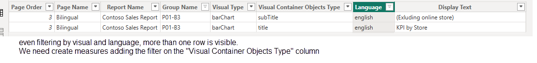
Now, only a few things to note on this step: The fields by which you will merge with the previous run, will be different depending on the table your are joining. Titles will only depend on the report, group name, and «visual container objects type» (i.e. is this a title a subtitle or what). For the fields in visuals we’ll need to add the column of the actual field being translated, as well as the role inside the visual (i.e is this for columns, rows or what). And so on. This set of columns will be used both for joining with the output table of the previous dataflow execution as well as the translation corrections (see next section). Remember, to make a deployment like this go smooth even though you don’t have the table yet in the lakehouse, my functions fxGetLakehouseTable and fxGetWarehouseTable will make your life easier as they allow you to pass an empty table as argument to be return if the table is not found.
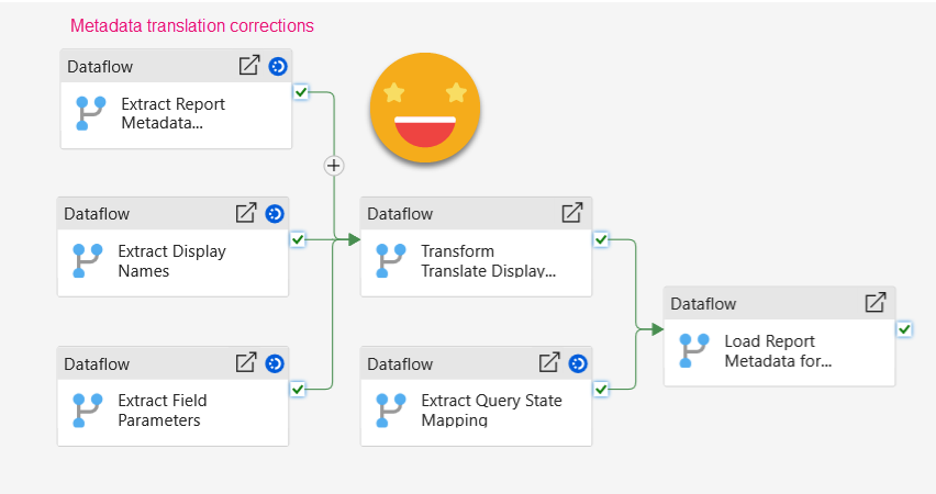
Add translation corrections
Yes, automatic translations are also bad for report metadata. What I’ve found is that casing may be off. In particular if the source language does not have such thing like Japanese (I mean they don’t even have spaces, why should they have upper case and lower case??). Well, so you will certainly need to enter some corrections. In the contoso model I used for this demo, a company name such as «The Phone Company» was dutifully translated to «La companyia telefònica» which is not probably what you want to see. But this is just an example.
If you find yourself fixing upper-case and lower-case things, remember that vertipaq is not case sensitive and it will pick whatever value it finds first and this is how all entries of that particular string will be shown. So it’s probably a good idea to sort all your entries to make sure that you enter a correction for all of those that are exactly the same, or you’ll go mad trying to understand why it will not change the casing of that particular word.
As in the data translation corrections excel we are using the timestamp recorded during the dataflow execution to make sure that we are refreshing only *after* the dataflow has run so that our carefully typed translation corrections are not lost in the air.
Also the other difference is that we’ll need done sheet per table as they have different schemas. At least in my implementation of the process.
![]()
Regarding the «Last Manual Modification» timestamp, having different sheets what I do is store that last modification in a single cell of a hidden sheet and link all sheets to that cell.
At this point all is left to do is to load all 4 pages to the landing lakehouse, but keeping only the rows with input in the translation corrections field, the rest is not necessary. It’s important to keep the naming convention to make the process scalable with a single function for all.
![]()
Load query state mapping
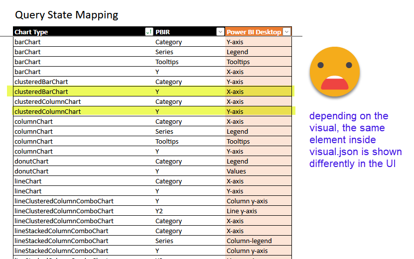
Ok, this step might not be necessary on every reload, but it does not hurt too much either. It’s a tiny table that «translates» the way visual.json calls things to what we see on the UI. It sounds unnecessary until you realize that the measure in a bar chart is placed in an object called «y» inside the visual.json file. It’s just a small thing to make our lives easier later when configuring the bilingual layer of the report. If some day I manage to do this whole process automatically, I might skip that, but for now it stays.
You might not need all the rows for your report but it does not hurt either. Just load the table as-is with snake_case headers into your landing lakehouse and we are good to go. We will use it in the next step
Translate the fields used (not the display names) and shape it for Power BI
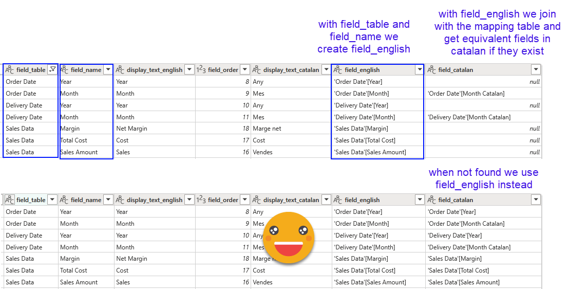
Since we just added the column with the translations earlier, we’ll use the output of the translations step to build the final tables. Now we need to provide the field that needs to be used in each visual when the language changes. For codes and numeric measures it will be exactly the same, but for fields containing human text like Colors, categories, product names and so on this will probably change and we need to provide the fields we carefully created in the first part of this series. As you will most certainly remember, in the same step in which we prepared all the different values that needed translation, we also created some tables ending with «_translation_field_mapping» where we would use the original field names and the original table name too.
Since all tables end in the same way and have the same schema, we’ll just filter the table list by those ending with «_translation_field_mapping» and we will expand to get all the rows from all those tables. We will have our own «Rosetta Stone» to get the equivalent fields to be used in visuals as well as in field parameters.

Now for the fields_in_visuals table as well as the field parameter table, we can join with this table. All rows that do not join we can keep the field we had, for those that do join we will use the new field when displaying in Catalan.
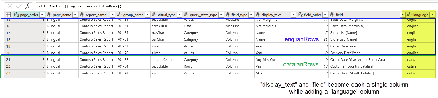
Before calling it a day we need to unpivot the display text and the field to be used. If we had say 5 different languages, the approach would be probably to concatenate display text and field for each language with a pipe or something, then unpivot them all, and then expand into columns again by the pipe character. Being just two I prepared both bits of the table, added a column with the language name for each of them and then appended both bits. Key point here is the final shape we are after:
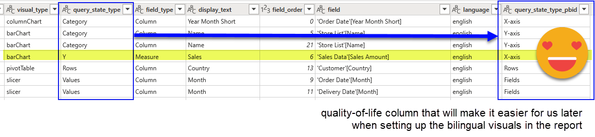
Last but not least let’s not forget to «translate» the query_state_type of the visual.json file to what we see in the Power BI Desktop UI
And that’s it! The process is very similar for field parameters table, and for titles and pages even easier as there are no fields to «translate».
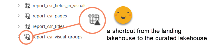
Don’t forget the shortcut!
As much as I we want to jump into the semantic model and finally have some bilingual goodness, we need to create yet one more shortcut (we created a lot of them on part 1). This time we’ll bring the visual groups to the curated lakehouse so that all we need in our semantic model can be found there. We need no transformation on that table so no need to make it go through some ETL process.
Bring it in the Semantic model (a.k.a field parameters galore)
Each element we load in the semantic model requires different task, we’ll try to order this from easy to no-so-easy:
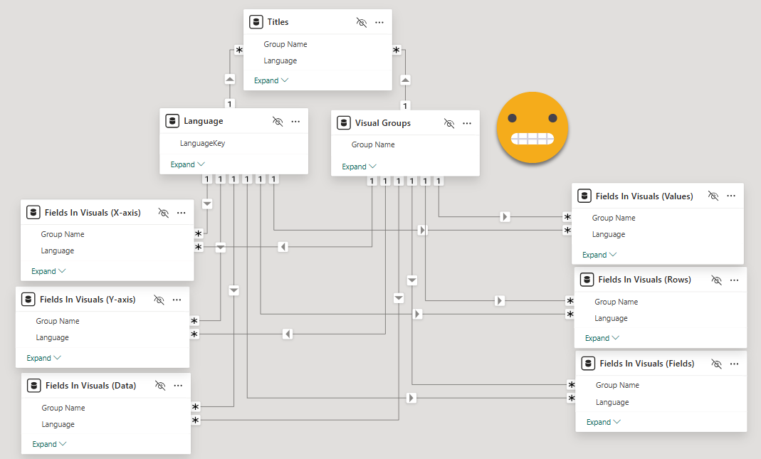
Visual Group and Language table: the «para-dimensions»
The easy bit in the semantic model is to load the the visual group table it’s just sort of a dimension for our bilingual para-model.
The other dimension in this para-model is the language. We’ll need a tiny table that will filter all the others saying which is the language to be displayed. Do it any way you like, power query importing from somewhere, power query out of thin air, or DAX, your call. It should look like this.
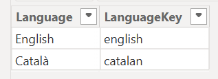
«LanguageKey» is what we used in the «language» column a couple of steps ago. «Language» is what the end user will see in the slicer.
Bring in the titles!
Before some more power query madness let’s do the last «easy» table. The titles table is loaded as-is. Before we go on, it’s time to do some modeling and housekeeping on the report layer to make our experience much much better.
Make sure the titles table has a relationship with the visual groups table and the language table.

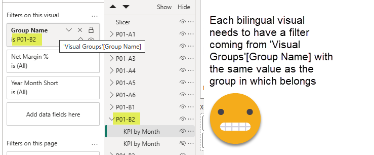
Next we’ll do something that is not super-fun, but it’s key to the whole thing. For each bilingual visual, we’ll add a visual-level filter coming from the Visual Groups table and it will be just it’s own group name.
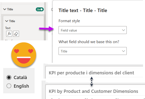
While you are at it, create single-value slicer coming from the language table. Therefore only the rows relevant to the visual and the language are visible for each visual. But that’s not yet enough to set up dynamic titles.
We’ll need to create four super-simple measures or so to realize its power. One to get the selected value, and the other three adding different filters to specify we want the title, subtitle or rather the textbox contents of certain visual.
Text = SELECTEDVALUE(Titles[Display Text])
Title = CALCULATE([text], Titles[Visual Container Objects Type] = "Title")
Textbox = CALCULATE([text], Titles[Visual Container Objects Type] = "textBoxContents")
Subtitle = CALCULATE([text], Titles[Visual Container Objects Type] = "subTitle")
And that’s it! If you want to show right away something to your boss or end user, just go to each bilingual visual (the non-hidden ones) and replace the title by the «Title» measure and voilà! If you did all the steps you should have one row and row exactly visible so that selectedvalue will pick up the value in the table and show it as the title, subtitle or else. Textbox does not allow you to make the text dynamic so pick your favorite alternative. I like the old KPI card because it handles multi-line text better than then new one, which cuts the text even when there’s plenty of space available.
Fields in Visuals, here we go!
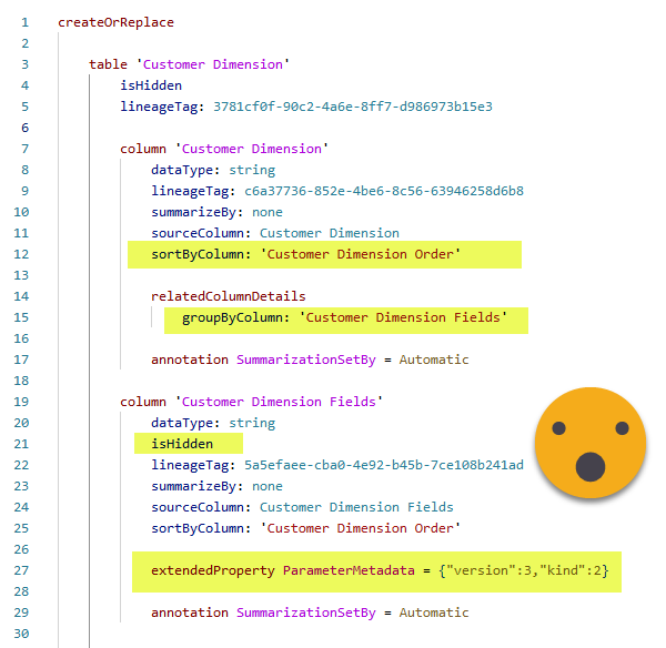
So this ends the warm-up. Now we need to get the contents of the fields_in_visuals table. But we cannot make the whole thing a huge field parameter and call it a day. We need to create a separate field parameter for each value in the query_state_type_pbid column. This will be the easiest way to figure out which field parameter we need to bring to each visual to make the bilingual magic happen. Other than filtering the table and making the headers look nice with fxSnakeCaseToSpaces function, there’s no other transformation needed.
Now comes though the secret sauce. To make the tables behave as field parameters we’ll need to add an extended property to the «Field» column and configure the «Group By Columns» property of the Display Text column be the «Field» column. Then of course we’ll order it by the Order Column and we’ll hide both the «order» and the «field» column, just like native field parameters. Since we’ll have to repeat the action for each of the tables created, I created a nice little C# script for that.
Of course this time around you will also need to make sure that the relationships with the Visual Groups table and the Language table are in place
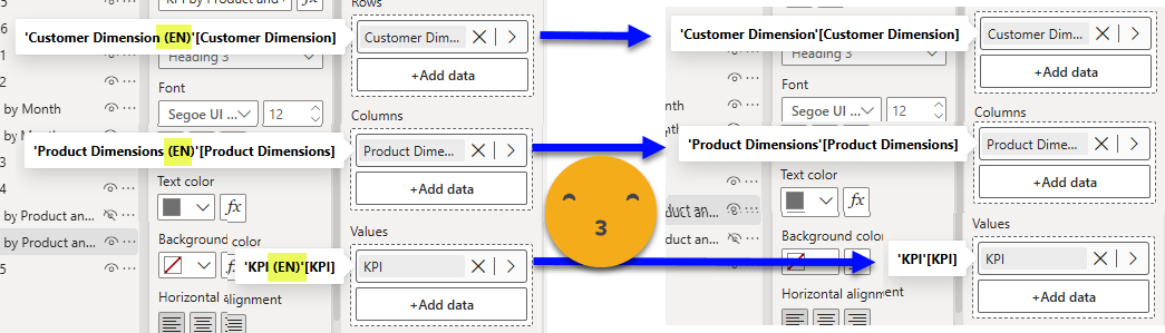
Once you’ve done this you can go to all visuals that use regular fields and swap then by the field parameter that matches the part of the visual in which they are. If you are in a bar chart, drag the «Fields in Visuals (x-axis)» field parameter into the x-axis section. And so on.
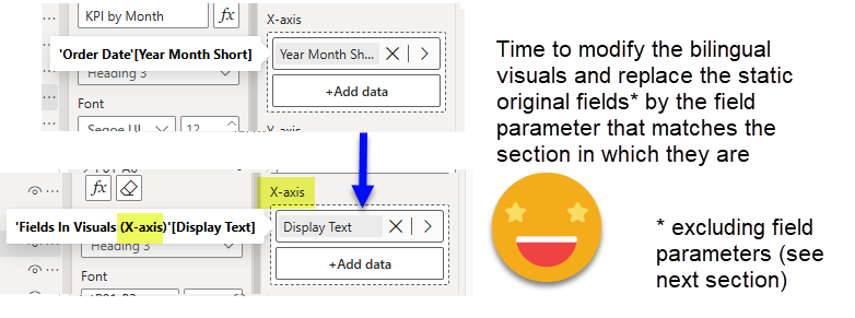
and you get this glorious result!
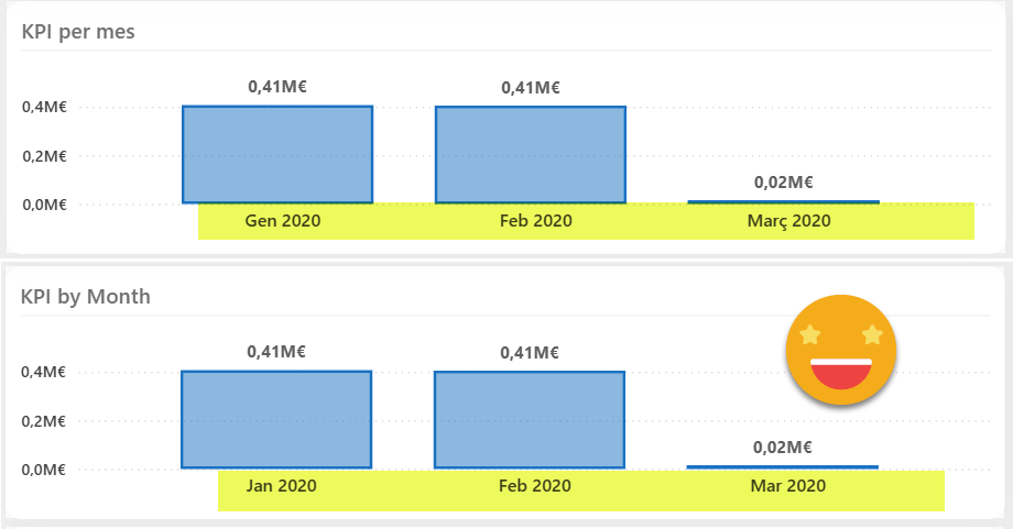
Now if you go back to the first part of this series, you will see that this chart originally has a 2-level axis with year and month. For the bilingual version I changed it to a single field axis because as of today (March 2025) the expansion state of fields used through field parameters is not persisted, and by default are always collapsed. That means that every time you change the language of the chart you would see a single column for the year and you would have to manually expand it again. Figured out this would be a better experience for the end user, but I do hope that they fix it sometime soon along with the sort order of the chart and other little things they still lack.
Once more thing. Note if the original visual type does not work with field parameters, you will need to come up with an alternative and of course in that case the name that you see in the UI will not match the field parameter you have to use. For instance, if your original visual is the new KPI card, it will be called Data, but for the matrix visual the area where you will be able to drag the field parameter with the measures it’s called «Values».

Not the end of the world, just be aware of it.
What about the field parameters?
Last but not least let’s go into the bilingual version original field parameters we had in our report. Field parameters are similar to the fields in visuals table in the sense that we need to filter the table of the lake house with as many field parameters as we had before starting this whole thing. But we need to restore the original field names. (I mean we don’t have to, but it’s much better if we do). Basically we work with three lists of three elements. Two are always the same, the names of the three fields containing the contents of the field parameter (mainFields), and the three fields containing the original names of the previous three (infoFields). And of course the list of these specific three names (fieldNames). We need to get the fieldNames using infoFields, rename mainFields with fieldNames, and get rid of the infoFields. I like how this one turned out so here is the detail.
And thus we get this table.
Now we just need to run the macro to make the magic and make it behave as a field parameter. Well and repeat for each different original field parameter. Remember that we signaled the «original» field parameters with «(EN)» at the end of their name.
If you are un unlucky soul who can’t get Tabular Editor, even version 2 in portable format, then these days you can do it with TMDL view and some patience. Here you have the main properties highlighted when you set up a table as a field parameter:
We can now complete our para-model with the field parameters. These are the only ones that are not filtered by visual. They are similar to the original field parameters, but can switch language along with the rest of the report. Isn’t it beautiful?
![]()
And of course, replace the original field parameters by it in the bilingual report and you are good to go!
You can now enjoy bilingual joy in your report! However, before you say it’s broken, let me remind you that values will be sorted differently, as they should be, because you know, language.
What about when I want to change something of the report?
Well I’m glad you made that question. You just need to go to the visual you want to change, hide the bilingual visual and show the original one. Now it’s freedom for you to change anything you want to change, such as the title, subtitle, fields used, display names, and so on. Formatting and other chart configuration does not travel from the original to the bilingual one so you will be better off just tuning the bilingual visual. Once you are done with the changes (which can include new visuals and so on, as long as you create the groups, put the alt text flag and so on), now it’s time to erase everything in the pbip folder where we saved it last time, and do another «save as» to that folder in pbip+pbir format. Wait for all files to sync, and execute the report metadata translation pipeline.
Once it finishes you just need to refresh your semantic model and all field parameters should have the right fields and display names, and the titles of course will be updated as well. Isn’t that sweet?
What if I need more languages?
That’s one of the questions I received at Global Power BI & Fabric Summit 2025 where I presented a super quick overview of this use case. The steps do not change at all. You will need to add extra columns for each language, and maybe the translation corrections get a bit trickier to load, but it’s certainly doable. Then as I mentioned, the unpivot of displayname and fields will need to be done by concatenating them first and expending after unpivot. But other than that I don’t see any major difference.
Wrap up
As you see the process is semi automatic and the manual bits can be still quite a pain, in particular with large reports. A script is not unthinkable, after all is just about creating group files, duplicating files, changing an Id here, adding a parentgroup there. Maybe even replacing the fields by the final field parameters can be automated one day. I guess it all depends on how many *real* reports people want to translate for real, with the data and everything. My guess is that it will remain a niche use case, but one very interesting as you need to dive into the inner workings of pbir, field parameters, and a long long etc.
I hope you enjoyed the ride and hopefully I’ll get to tell this story in data events, although to fit even the highest level structure is a challenge in the traditional 50 min session.
Thank you so much for reading all the way to the end.
Please follow the conversation on LinkedIn and Bluesky.