Ok, this article brings together all the topics that I’ve had in my mind lately. I have talked in the past about Visual calcs and how they break when you swap a field by another, and also how you can play with them to make the line of a combo-chart fly above the columns. As I said at the moment… «I can’t wait to encapsulate all this logic» or something to that effect. Well, the day has come. But just encapsulating logic in a UDF still leaves with the hassle of creating each of the visual calcs, and assigning them to the max and min of both axis (whats the plural of axis??). What if we could automate *ALL* of this in a C# Script??
Continue Reading..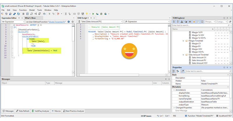
DAX UDFs are here and as anticipated they are indeed revolutionizing the way we write DAX. Indeed together with the introduction of DAX UDFs, «the italians» presented «daxlib.org» a common repository for sharing Model-independent DAX UDFs. I’m also contributing there and I’ve seen how many commits and pull requests are going on and it’s quite amazing. All those functions, though, are –again– model-independent. Which is great, of course. But sometimes we want to make functions that are quite similar, but not quite the same. They have some dependencies on the model, but achieve the same kind of transformation. Just like calculation groups. What is to be done then? Well, we can always write a script that will customize then for us on run-time. Just like we did with calculation groups!
Continue Reading..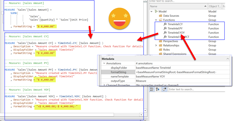
YES! Public preview is finally here, and DAX UDFs have the potential to change how we write DAX in a big way. If you don’t know what UDFs are, head over to Microsoft (and SQLBI of course) and learn everything they have said about them first, no point in repeating it here. If you want to go deeper, come along!
Continue Reading..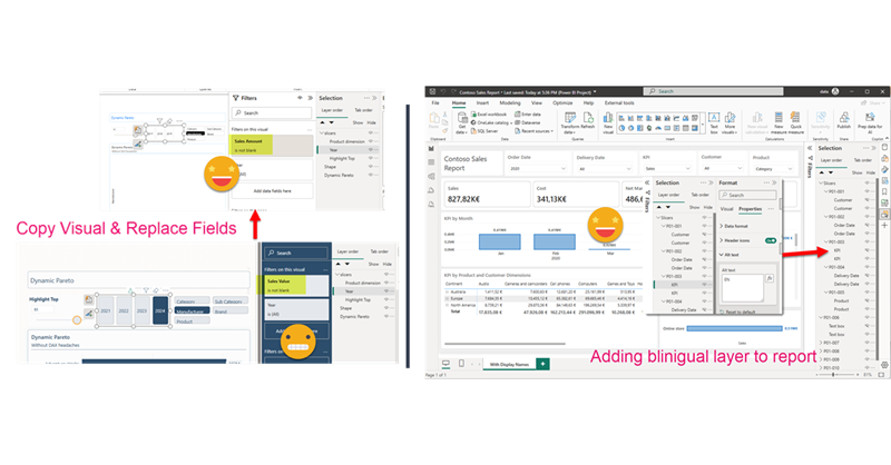
Hello again. Today I’ll introduce two new Tabular Editor C# Scripts that might help you at some point if you are already using the PBIR format (which is in preview, so don’t rush it!). The first one is to copy a visual, which at first does not look impressive, but remember that swapping fields in Power BI desktop breaks many more things that you would expect. Next we’ll see a script I built for myself if I ever have to make another report bilingual. The initial report preparation phase is now automated. That’s only part of the work, but still it’s an nice improvement.
Continue Reading..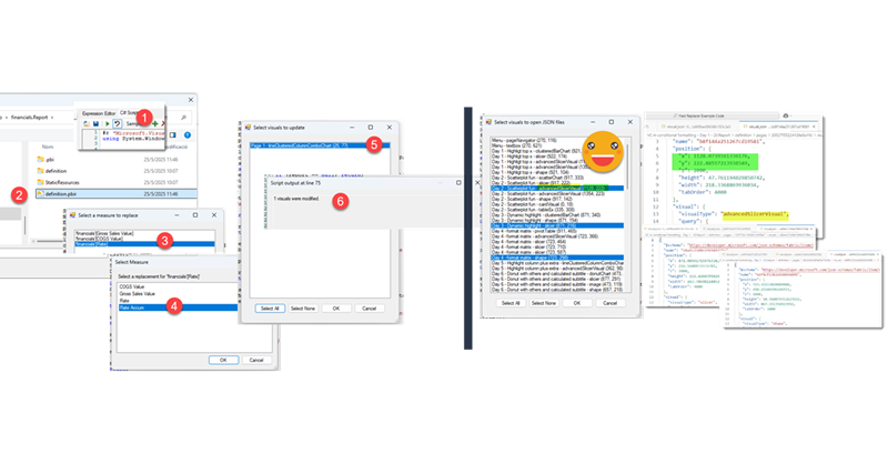
In comparison with my previous post, this one was an absolute breeze to write. Just an idea, some little tweaking with ChatGPT and GitHub CoPilot. Both come from the daily little miseries of daily with Power BI. One is replacing fields in a visual, the other one is finding the visual.json file of certain visual to see how to tackle that bit of configuration you want to change. Let’s get to it.
Continue Reading..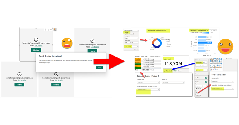
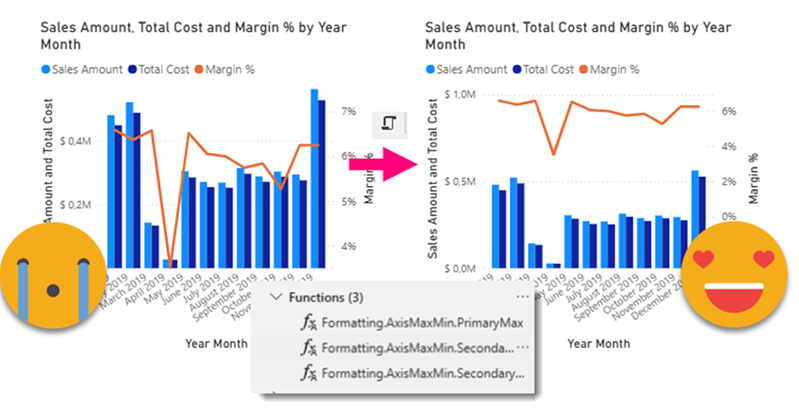
This is quite crazy. I was trying to write a quick blog post to get back in swing over here, so I thought of a stream lineddd approach set maximum and minimum values for axis to properly show data labels, with a calc group and so on. Then it was impossible for me to sshow an example of the problem I was trying to solve. But then worse. I realized that you can now use visual calculations for those! So my approach was dobsolete before I presented it to the world. Of course I wanted to do something, and as usual I’m very much about automating stuff. Would it be possible to automate the creation of visual calculations?? Well, for that I would need to really parse the visual.json files of the new pbir reports. I have played around modifying the report layer before, but this time I had to do it for real. Instead of creating new stuff, I wanted to look at was already created! Time to tackle all those little jsons.
In this post I’ll explain how I authored a script that detects broken references in PBIR reports, asks the user for replacements, and then fixes the report. However, this is just the excuse, the way I wrote it opens the door to pretty much any script you can think of to modify the report layer. Let’s get started!
Continue Reading..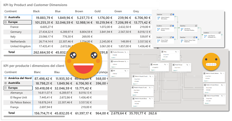
Hello again!
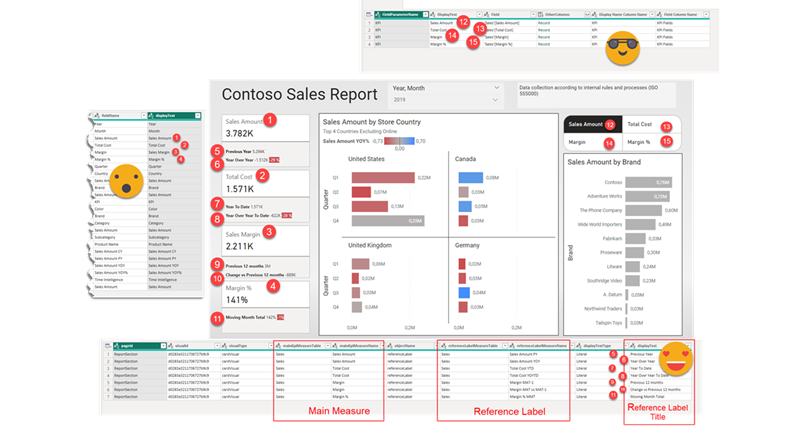
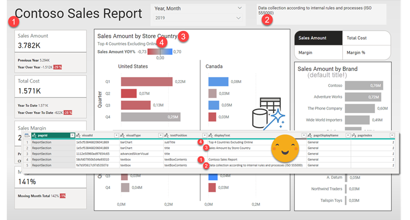
Before life gets in the way, let’s try to wrap this up. If you have not red the first part, please do so before reading this one as some of the outputs of that part are necessary for the process we’ll see here. In this post I want to tackle the actual report. Since it’s not really data what we’ll translate I’ll call it metadata, but it’s not metadata either. We’ll extract all the titles, subtitles, text boxes, as well as which fields are used where, and crucially what’s the display name that is being used for a particular visual. Of course we may find a field for which no specific display name has been set, but we’ll use the original field name as display name and we’ll take it from there. But enough of all this talking, let’s get to it!

Hello hello,
It’s been quite a few months since I last published. As I was going down the rabbit hole at work I thought it would be a good idea to blog my way through the tunnel. It turns out it was not. The sheer complexity of the task and some big gotchas rendered the approach unfeasible.
Now that the report is in production, it is time I try to write up the approach in a way that makes sense.
Hello again! This article is part of a series, so if you just discover this, I strongly recommend you start from the beginning. Let’s continue digging through the visual.json files. Today we’ll extract the fields used in visuals and we’ll figure out a way to extract the the first column of field parameters, where we set up the names we want to use. Yes, we’ll need to translate these as well.
Hello again,
after some inactivity the blog is flourishing again. It’s not really something I control. When there’s something I want to write in the blog, I suddenly imagine all the bloggers out there about to write the exact same blog post elsewhere, so I just need to do it, and do it fast. This is something I’ve been doing for real, but really applies in general so I think many can benefit from it. I’ve been asked to take *the* report and make it bilingual. But bilingual for real, so this includes everything: Titles, legends, data, everything. This is a topic that has been addressed a number of times, and yes, there are demos out there. However, the use cases presented in general are either very simple or they start with a project that from the start was known that it had to be bilingual. The reality is, though, rather more complex. I’ll try to write as I progress through this project once I have figured each one of the steps. Let’s do it.