Category: Power BI


Hello hello, it’s been a while since my last post because, well because… stuff, you know.

Anyway, today I want to talk about a solution I put together at one of my customers in order to orchestrate refreshes, so that dataset refresh once the precedent ETL jobs have successfully completed (never before that) and at the same time do not overwhelm the server. I’m sure that there are a thousand other ways to do it, but I have not seen many articles on «Dataset refresh orchestration with Power Automate» so I thought that could help others facing the same struggle. In this first part I’ll focus on the Power Automate side of things and I’ll leave the Power App for the second part. Let’s start:

Continue Reading..

I know, it’s a terrible title, but it’s the best I could come up with. This blog post is to explain a workaround for a behavior I detected while playing with a field parameter (all measures) and a stacked column chart. The problem is as follows: If you have more than one measure in the chart, you can define a color for each measure and all works fine. However, if you filter your field parameter table in a way that only one measure is used in the chart, then that color is ignored and you get a default color. What’s even worse is that the same color will be used whenever a single measure is included, so you can’t even configure it again to get the right color. Fighting the same issue? Keep  reading!

Continue Reading..

Hello!

Today (well yesterday by the time I have finished writing this) saw a great use case of calculation groups and I wished I had come up with the idea myself because it’s awesome and something that I’ve come across sometimes. In a table there’s a breakdown by month, and at the total they want to see sum, but also want to add another column with say the average, but could be also the value last year or growth. Yes, I’m talking about the latest video from Chandeep Chabbra. The video is beautifully set up so it’s definitively worth a watch.

Even though there’s a few things I would change from the DAX of the format string expressions, that alone would not justify a blog post about the same use case. But yet I wanted to play with the calc group, so what I plan to do instead is to show you the process to «industrialize» this calculation group, i.e. how to create a script that will replicate similar logic whenever you want to use it. Yes, I mean a c# script. That’s something I’ve been doing lately in some sessions,  but it’s not yet in the blog so why not use this occasion for it.

Continue Reading..

Hello,

today I’m not writing any type of tutorial. I just want to share a weird behavior I have found in calculation groups, hoping that those that really know about the inner workings can help us comprehend why they behave like that. Calculation groups can be seen as groups of pairs of DAX expressions that replace measures and their format strings when they are in a filter context where they participate. There’s quite a few articles that explain calculation group precedence, but when a calculation item is applied, how are the values of SELECTEDMEASURE and SELECTEDMEASUREFORMATSTRING evaluated? are they the values and format string *before* anything is applied? What happens if we include SELECTEDMEASURE inside the format string expression or SELECTEDMEASUREFORMATSTRING inside the value expression? If your head is about to explode, you are not alone.

In the different posts of this blog I’ve reached different conclusions in different articles, so today I want to present two examples to deepen in this topic — during this process I hope to understand it more!

Continue Reading..

In Power BI there are plenty of features to allow people discover content, but I don’t think it’s really useful. For once, with the exception of promoted & certified datasets, you only find what you have access to, and in many places access is given on a one-by-one basis. You ask for it, you get it and and you go on with your life, but you don’t know what you don’t know, and that can be limiting. Sometimes information is not shared because no one has bothered to share it (maybe because they don’t have role-based security groups). What if we could show a list all the apps that are out there and you could search simultaneously  in app name, app description, report name and report description? The link to the app allows you to request access. Sounds good? Let’s get started!

Continue Reading..

Hi! actually I was writing another blog post, but today I was shown something that can be done with calc groups that I wasn’t aware of. And not only that, even though the blog post I was shown had some very clever thinking behind, I found there’s still some room for improvement to bring the technique to the next level. We are talking about sorting a matrix by a calculation item placed at the columns section. Let it be said that in many use cases you might be better of just generating the measures with a script (as I showed in this blog post) and using the measures instead. That will give you more control with the UI since each column is indeed a different measure. Yet, there’s something cool in doing things in different way, so I’ll go ahead nevertheless.

Continue Reading..

This blog post is 90% SQL server and 10% Power BI, so if you are not into SQL Server (or relational databases in general) this might not apply to you. That being said, this blog post explains how to record the size of all tables in the server, and how to measure which tables are being used without enabling query-logging which can bring your server to a halt (or at least so I’ve been told by the DBA).

Some context, in one of my clients they do have most of the data that they manage in a SQL server with ODS replications of operational databases and a data warehouse where all serious reporting should be based. In that sense they have things pretty much sorted out if we compare them with companies that still do critical reporting based on excel files on a SharePoint. Yet, even having a very expensive server we often run into problems and space is always a problem. So we figured to do something about it.

Continue Reading..

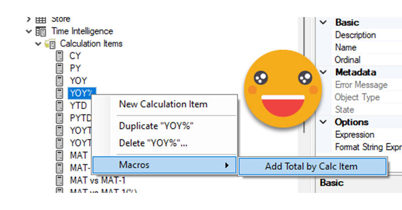
Hello hello, today is C# again. As you know I do like C# scripts for Tabular Editor, as they allow us to automate stuff around Editor, which in turn allow us to do things faster than in Power BI Desktop, so it’s like a super power on top of a super power. In my previous post on the topic, I talked about using a custom class to be able to reuse code, making your scripts, shorter to write, and more robust, as you can put all the bells and whistles once in you custom class and reuse forever. That approach is awesome, but it had still two remaining aspects preventing larger adoption. One is that the set up as a bit of a pain. And the other is that copying the code to tabular editor is not as fast as one would like. You need to select the code of the macro, then the custom class, then fix all the external references at the top, etc. Well, today I’ll talk about a repository that will allow you to start coding in almost no time, and a script that will copy any of the macros of your Visual Studio file *along with the custom class code* and even combining all the external references of both the macro and the custom class. How cool is that?!

Continue Reading..

Yep, today it’s reporting. Lately I’m trying to give some shape to the governance of an organization, and well, reports having a unified look it’s a good thing. At the very least for those supposed to be «Tier 1» or «The reports that really matter to top brass people». As with business logic, I’m all in when it’s about centralizing stuff in one place, and report themes are indeed this: a file that stores the default configuration for pretty much any setting of your visual objects, page and so on. However, Power BI Desktop does not really allow you to setup everything in the theme, and the alternatives were either editing a huge json file or using tools that were not quite up to the task until not long ago. This has changed and I’m completely addicted to the theme generator that Mike Carlo has put together in Powerbi.tips. IT’S AWESOME.

Continue Reading..

Hello hello, I’m not writing that much lately due to spring break and a DAX training I’m teaching, but I think I have just enough time to explain a fun use case I found the other day at work. In Real Estate each asset can be in a bunch of different states, especially if there is litigation, squatters, repairs etc. So in this case they want to compare the latest snapshot with the snapshot of one week ago, and see how many assets they have in each state, but also in which state were they a week ago. Let’s get to it!

Continue Reading..


Contacto

Contacta con nosotros y descubre el poder de la información.

Nombre
Email
Consulta

Ok! Mensaje enviado.
Error! Verifica los campos.
© Copyright 2022 - Esbrina